
Through the course of the next several weeks I'll be posting about the best film noir poster designs, counting down from 100 to 1. With each poster I’ll try to include a few brief thoughts, along with a high-quality copy for download. Considering that I’m fairly OCD I’ve put a ton of thought and plenty of work into this — I’ve also given myself a set of guidelines to work from, here they are:
What’s eligible:
1) Only classic period films can be considered (nothing after 1960), though my definition of film noir will be somewhat looser than in my essays.
2) Only American issue posters of American films will be considered.
3) Only standard one-sheets will be considered. (No half-sheets, 3 or 4 sheets, lobby cards, inserts, daybills, etc.)
4) No re-release, reprints, or retrospective posters allowed. Only original, first-run, theatrical release posters.
5) Only posters to which I have access were considered. (500+ classic period films, this is pretty comprehensive.)
Judging criteria:
1) Design quality / Artistic merit. (Composition, color, balance, typography, use of illustration / photography, graphic power, and so forth.)
2) Concept. (How well does the poster communicate the film's message? Is the poster authentic? Is it misleading? Does it reach the intended audience?)
3) Staying power. (Is the poster iconic? Has it taken on a life of its own, apart from its film? Is it widely sought after?)
4) Originality / Novelty. (We like artistic risk-takers, and will reward them!)
5) The Blank Slate rule. (All films are equal. Double Indemnity doesn’t get a bump for being Double Indemnity. As a matter of fact, it doesn't even make the list (see below!). In all likelihood, many readers will not have heard of all films on the list, and many will be seeing the posters for the first time. That should be half the fun.
6) My personal taste. (The least significant of the criteria. My choices are guided primarily by the above, though it would absurd to imagine my personal likes and dislikes — as well as my emotions — didn’t play some part in my choices. However I’m not hiding behind personal opinion: this is not a list of my favorites. This is an empirical list of what I consider to be the best, with my personal likes and dislikes shoved as far to the side as possible. And while any such list is, of course, purely opinion, you may have faith that this is a highly educated and professionally seasoned opinion!) On that note, feel free to argue with me and let me know what you think of my choices. My biggest reason for doing this is to generate discussion.
To put into perspective all the ridiculous hot air above, I thought it would be a good idea to start with a few posters that didn’t make the list, and why. Hopefully, this will shine some light on my thought processes in advance of the countdown beginning next week. Thanks, and stay with me. (And if this is a stupid idea altogether, someone kindly let me know. I’m as nervous as Elisha Cook Jr. about this.)
 Double Indemnity (1944)
This is a good place to start, with a bad poster for possibly the greatest of all noir films. Remember: we are judging poster designs, not the films they represent. Considering that Double Indemnity is a prototypical film noir, there wasn’t anything remotely resembling a noir style in poster design, though we’ll see one surface throughout the countdown. Before this film, Freddie Mac had primarily appeared as the male lead in romantic comedies, usually in support of a bigger female star — like Stanwyck. Meanwhile, Barbara was an A-list star of women’s pictures. With this in mind, it’s easy to understand not only the pink color choice, but why the poster looks so … romantic. In a nod to this being a crime picture, Fred is holding a gun — but shouldn't Phyllis be holding it? Shouldn’t the poster’s hint at “badness” be focused on her? In this poster she’s appears to be just another gangster’s moll in the thirties tradition. Meanwhile, Eddie’s disembodied bust floats just to the side, as if about to shout, “Get a room!” at the young lovers. Fred and Barbara seem cramped too, as if they have to bend uncomfortably underneath the weight of their own names above. Here’s a poorly composed poster that fails to get at what its film is all about, and therein lies the failure. Oh, and where’s the anklet? It was a honey.
Double Indemnity (1944)
This is a good place to start, with a bad poster for possibly the greatest of all noir films. Remember: we are judging poster designs, not the films they represent. Considering that Double Indemnity is a prototypical film noir, there wasn’t anything remotely resembling a noir style in poster design, though we’ll see one surface throughout the countdown. Before this film, Freddie Mac had primarily appeared as the male lead in romantic comedies, usually in support of a bigger female star — like Stanwyck. Meanwhile, Barbara was an A-list star of women’s pictures. With this in mind, it’s easy to understand not only the pink color choice, but why the poster looks so … romantic. In a nod to this being a crime picture, Fred is holding a gun — but shouldn't Phyllis be holding it? Shouldn’t the poster’s hint at “badness” be focused on her? In this poster she’s appears to be just another gangster’s moll in the thirties tradition. Meanwhile, Eddie’s disembodied bust floats just to the side, as if about to shout, “Get a room!” at the young lovers. Fred and Barbara seem cramped too, as if they have to bend uncomfortably underneath the weight of their own names above. Here’s a poorly composed poster that fails to get at what its film is all about, and therein lies the failure. Oh, and where’s the anklet? It was a honey.
 High Wall (1947)
I’m a tough customer, and sometimes an unfair critic. Dig the typography here — it’s fantastic. The careful way in which the perspective of the performer’s names matches the brick wall is wonderful — it integrates the typography and the image very effectively, while the brushstroke style of the title is perfectly hand-rendered and appropriate for the brick background. This thing is so great! That is, until you ask yourself why Audrey Totter’s head is growing out of Robert Taylor’s shoulder. Ouch! Admittedly, although having Audrey’s head attached to your shoulder might not be a bad thing in real life, it sucks all the life out of a poster design, and pushes this too far in the direction of camp.
High Wall (1947)
I’m a tough customer, and sometimes an unfair critic. Dig the typography here — it’s fantastic. The careful way in which the perspective of the performer’s names matches the brick wall is wonderful — it integrates the typography and the image very effectively, while the brushstroke style of the title is perfectly hand-rendered and appropriate for the brick background. This thing is so great! That is, until you ask yourself why Audrey Totter’s head is growing out of Robert Taylor’s shoulder. Ouch! Admittedly, although having Audrey’s head attached to your shoulder might not be a bad thing in real life, it sucks all the life out of a poster design, and pushes this too far in the direction of camp.
 Dragonwyck (1946)
Here’s a flaw that eliminated numerous posters along the way — this isn’t even a particularly egregious example. I don’t know who that woman is, but it sure isn’t Gene Tierney. Even if it does bear a passing resemblance to Tierney, I’m almost certain that Tierney’s earlobe connects to her jawline rather than her cheek. This is a pleasant enough poster otherwise, but illustrations simply have to resemble the performers in question.
Dragonwyck (1946)
Here’s a flaw that eliminated numerous posters along the way — this isn’t even a particularly egregious example. I don’t know who that woman is, but it sure isn’t Gene Tierney. Even if it does bear a passing resemblance to Tierney, I’m almost certain that Tierney’s earlobe connects to her jawline rather than her cheek. This is a pleasant enough poster otherwise, but illustrations simply have to resemble the performers in question.
 The Dark Mirror (1946)
It should have been “The Fun House Mirror” instead. Just to hammer home the point from the previous poster: I don’t know who the fat woman is, but it certainly is not Olivia DeHavilland. It is also hard to imagine that the female figure in the inset illustration is somehow her twin, despite the tagline’s claim to the contrary. In order to make the cut, the illustrations have to be accurate, well-composed, and well-executed.
The Dark Mirror (1946)
It should have been “The Fun House Mirror” instead. Just to hammer home the point from the previous poster: I don’t know who the fat woman is, but it certainly is not Olivia DeHavilland. It is also hard to imagine that the female figure in the inset illustration is somehow her twin, despite the tagline’s claim to the contrary. In order to make the cut, the illustrations have to be accurate, well-composed, and well-executed.
 A Cry in the Night (1956)
The poster misrepresents the film, suggesting that Natalie Wood is a bad girl, which is not at all the case. The central image even goes so far as to suggest she’s been assaulted, or worse, been a willing participant with Raymond Burr. And while Natalie and Raymond were apparently banging away at each other during the production of this film, nothing like this actually happens on-screen. Clearly marketed to cash in on the “juvenile delinquency” craze at the time. Too bad, this is a first-rate design otherwise.
A Cry in the Night (1956)
The poster misrepresents the film, suggesting that Natalie Wood is a bad girl, which is not at all the case. The central image even goes so far as to suggest she’s been assaulted, or worse, been a willing participant with Raymond Burr. And while Natalie and Raymond were apparently banging away at each other during the production of this film, nothing like this actually happens on-screen. Clearly marketed to cash in on the “juvenile delinquency” craze at the time. Too bad, this is a first-rate design otherwise.
 Stranger on the Prowl (1952)
Paul Muni was one of the great leading mean of the 30s, and his career would come to a close shortly after this effort. However, just because the tagline says “They were hunting him down like a mad dog” doesn’t mean you have to make Muni look like one. The actor more closely resembles a Lon Chaney Wolf-Man, or possibly freckle-faced Benny, the dog-faced boy from White Christmas than he does a highly respected Academy Award winner. Furthermore, someone needs to tell that copper that if he pulls the trigger he’s going to blow Joan Lorring’s head clean off. Bad composition can be dangerous! Still though, what a great mustache.
Stranger on the Prowl (1952)
Paul Muni was one of the great leading mean of the 30s, and his career would come to a close shortly after this effort. However, just because the tagline says “They were hunting him down like a mad dog” doesn’t mean you have to make Muni look like one. The actor more closely resembles a Lon Chaney Wolf-Man, or possibly freckle-faced Benny, the dog-faced boy from White Christmas than he does a highly respected Academy Award winner. Furthermore, someone needs to tell that copper that if he pulls the trigger he’s going to blow Joan Lorring’s head clean off. Bad composition can be dangerous! Still though, what a great mustache.
 On the Waterfront (1954)
Continuing the theme of destroying the iconic looks of a leading man, get a load of this monstrosity. Is that Marlon Brando? Look at his makeup, for Pete's sake! No wonder he had such a hard time on the docks. One of the worst major motion picture posters of this, or any era.
On the Waterfront (1954)
Continuing the theme of destroying the iconic looks of a leading man, get a load of this monstrosity. Is that Marlon Brando? Look at his makeup, for Pete's sake! No wonder he had such a hard time on the docks. One of the worst major motion picture posters of this, or any era.
 The Racket (1951)
The Racket. In case you missed it, The Racket. Got it? The Racket. Enough said.
The Racket (1951)
The Racket. In case you missed it, The Racket. Got it? The Racket. Enough said.
 Scarlet Street (1945)
 The Red House (1947)
In the design business we call this a “lift.” Eddie’s face, the yellow box, the red circle around the title. Let’s keep the stealing in the movies. What’s more, the barking dog beside the lamp post in the Scarlet Street poster in no way resembles Joan Bennett (or any other woman), and Eddie looks too much lice Rico Bandello and not enough like meek cashier Chris Cross.
The poster for The Red House is misleading — nothing about the movie is as sexualized as the artwork would lead you to believe. Finally, despite the red outlines, the title typography on both posters is too small. Poster design lesson #1: They have to work from across the street. Three strikes and you’re out. Right, Lazylegs?
 Strangers in the Night (1944)
Finally, posters simply need to be better than this. Low budget or not, big studio or not, the poster is often the public’s first impression of a film, so it needs to be good. This one isn’t — in any way. The typography is static and boring, not to mention difficult to read at the top and bottom, and the illustration is positively atrocious. Get a load of those faces. Anthony Mann, what were you thinking?
Strangers in the Night (1944)
Finally, posters simply need to be better than this. Low budget or not, big studio or not, the poster is often the public’s first impression of a film, so it needs to be good. This one isn’t — in any way. The typography is static and boring, not to mention difficult to read at the top and bottom, and the illustration is positively atrocious. Get a load of those faces. Anthony Mann, what were you thinking?
The countdown starts Friday of next week with posters 100 – 91. Hope you are here. Maybe if this is of interest I can branch out to other films styles in the future. In the meantime, hit me with some comments letting me know if this sort of thing is of any interest!
5) The Blank Slate rule. (All films are equal. Double Indemnity doesn’t get a bump for being Double Indemnity. As a matter of fact, it doesn't even make the list (see below!). In all likelihood, many readers will not have heard of all films on the list, and many will be seeing the posters for the first time. That should be half the fun.
6) My personal taste. (The least significant of the criteria. My choices are guided primarily by the above, though it would absurd to imagine my personal likes and dislikes — as well as my emotions — didn’t play some part in my choices. However I’m not hiding behind personal opinion: this is not a list of my favorites. This is an empirical list of what I consider to be the best, with my personal likes and dislikes shoved as far to the side as possible. And while any such list is, of course, purely opinion, you may have faith that this is a highly educated and professionally seasoned opinion!) On that note, feel free to argue with me and let me know what you think of my choices. My biggest reason for doing this is to generate discussion.
To put into perspective all the ridiculous hot air above, I thought it would be a good idea to start with a few posters that didn’t make the list, and why. Hopefully, this will shine some light on my thought processes in advance of the countdown beginning next week. Thanks, and stay with me. (And if this is a stupid idea altogether, someone kindly let me know. I’m as nervous as Elisha Cook Jr. about this.)
 Double Indemnity (1944)
 High Wall (1947)
 Dragonwyck (1946)
 The Dark Mirror (1946)
 A Cry in the Night (1956)
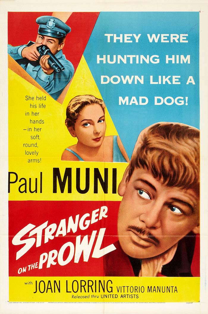 Stranger on the Prowl (1952)
 On the Waterfront (1954)
 The Racket (1951)
 Scarlet Street (1945)
 The Red House (1947)
The poster for The Red House is misleading — nothing about the movie is as sexualized as the artwork would lead you to believe. Finally, despite the red outlines, the title typography on both posters is too small. Poster design lesson #1: They have to work from across the street. Three strikes and you’re out. Right, Lazylegs?
 Strangers in the Night (1944)
The countdown starts Friday of next week with posters 100 – 91. Hope you are here. Maybe if this is of interest I can branch out to other films styles in the future. In the meantime, hit me with some comments letting me know if this sort of thing is of any interest!
This is a terrific series, looking forward to your next installment. So interesting! Congratulations on your anniversary.
ReplyDeleteThanks Jackie, I think I need to work out the kinks on posting images, but it should make a bit more sense visually now.
ReplyDeleteYeah! This is great. Looking forward to future posts.
ReplyDeleteHappy blog-aversary!
ReplyDeleteI'm really looking forward to this series! I'd love to see some more of the ones that didn't make the list too.. your commentary on these was hilarious! :)
Mark, if I remember right Brando is pretty heavily made up in the final scene of Waterfront. In at least one shot he looks almost more like a sad clown than a beat-up dock worker. But you're right about that poster. I like the Cry in the Night poster too, but I'll take your word on how it misrepresents the movie. What a shock for Hollywood!
ReplyDeleteLooking forward to more. This was a great start.
Thanks all!
ReplyDelete@ Kate: I may include one or two that didn't make the list each week when I post. It occurred to me when I was writing that they are really fun to dissect, and are often more interesting that the stronger posters — and there are plenty remaining!
@ Sam: Your memory serves about Brando's look, but I have a hard time rationalizing using the image for the poster. A Cry in the Night is a pretty good film; the star is actually Edmond O'Brien, who somehow ends up on the poster design equivalent of the cutting room floor.
Amazing.
ReplyDeleteBTW, Congratulations for the 2nd Year.
And best wishes for further years.
I love this idea for a list! Can't wait to see your picks. And happy blog-aversary!
ReplyDeleteGreat idea! I'm excited to see how this turns out. And congratulations for your two years!
ReplyDeleteThat shot of Brando in the "Waterfront" poster looks sublimely awful...like Lon Chaney testing a "Brando" make-up, if such a thing were possible.
ReplyDeleteLove the blog, mark; keep up the good work. This poster idea is a really good one!
I've learned quite a lot over these past two years' worth of work you've contributed.
ReplyDeleteCongratulations and... keep it up!
The Double Indemnity poster reminds me of one of my least favorite film posters.
ReplyDeletehttp://www.mattfind.com/12345673215-3-2-3_img/movie/l/j/m/his_girl_friday_1940_580x888_5034.jpg
The yellow dress that is not worn in the film. RR doesn't even wear any kind of gown. Th fact that it doesn't look like RR. The fact that it seems like it might be a melodrama and not one of the best comedies of all time. And yet I have this poster because Cary looks decent and because all the poster for this film pretty much suck. Anyway that stupid yellow gown struck a nerve.
Jenny, I agree with you about the RR yellow dress, but even more so about the misrepresentation of the movie. I guess with such stars, the idea was simply to put their mugs front and center and let the star power do its thing. Too bad, because there's so much content in HGF that would have made for a cool poster.
ReplyDelete